This piece uses Surfmist® and Monument® as two reference points on the COLORBOND® steel colour chart, to explain how light and dark colours behave and how the shades between them can suit different climates, styles and material palettes.
Two of the most familiar colours on any COLORBOND® colour chart sit at opposite ends of the spectrum. One is a soft off-white. The other is a deep charcoal. Most homeowners and builders get familiar with them early in a project, often before any other colour is shortlisted. Surfmist® and Monument® work across so many homes and settings they have also become a useful starting point for thinking about COLORBOND® steel colours in general.
A spectrum, not a list
It helps to think of the COLORBOND® steel colour palette as more of a spectrum, rather than a list. Light reflective shades sit at one end. Deeper, heat absorbing shades sit at the other. Everything else, from earthy mid-tones to soft greys, falls somewhere between.
That spectrum carries practical information. Lighter colours generally reflect more solar heat. Darker colours generally hold onto solar heat more. How a colour performs on your home also depends on roof pitch, orientation, insulation and climate zone.
For published nominal values you can refer to BlueScope Technical Bulletin TB-39, which sets out the thermal performance of each COLORBOND® steel colour.
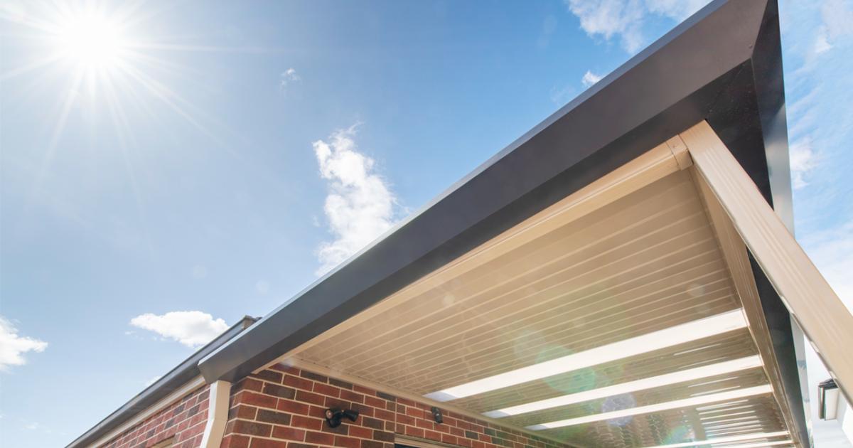
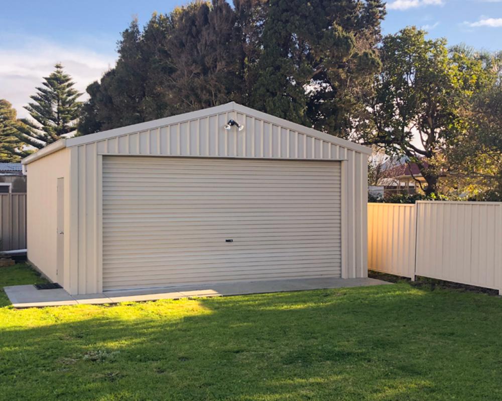
Surfmist® COLORBOND® steel: the lighter end
Surfmist® COLORBOND® steel is one of the most widely chosen pale tones in the BlueScope range. It reads as a clean, soft white with a hint of warmth, which is part of why it sits comfortably next to so many materials.
Surfmist® tends to suit:
- Coastal and warm-climate homes, where reflectivity matters
- Beach houses, weatherboard cottages and Hamptons-style builds
- Contemporary homes paired with timber, render or stone
A combination of roof, gutters and fascia in Surfmist® gives a calm, finished look without competing with the rest of the building. In a matt finish, the surface softens further and reduces the glare a high-sheen white can throw off in bright Australian sunlight.
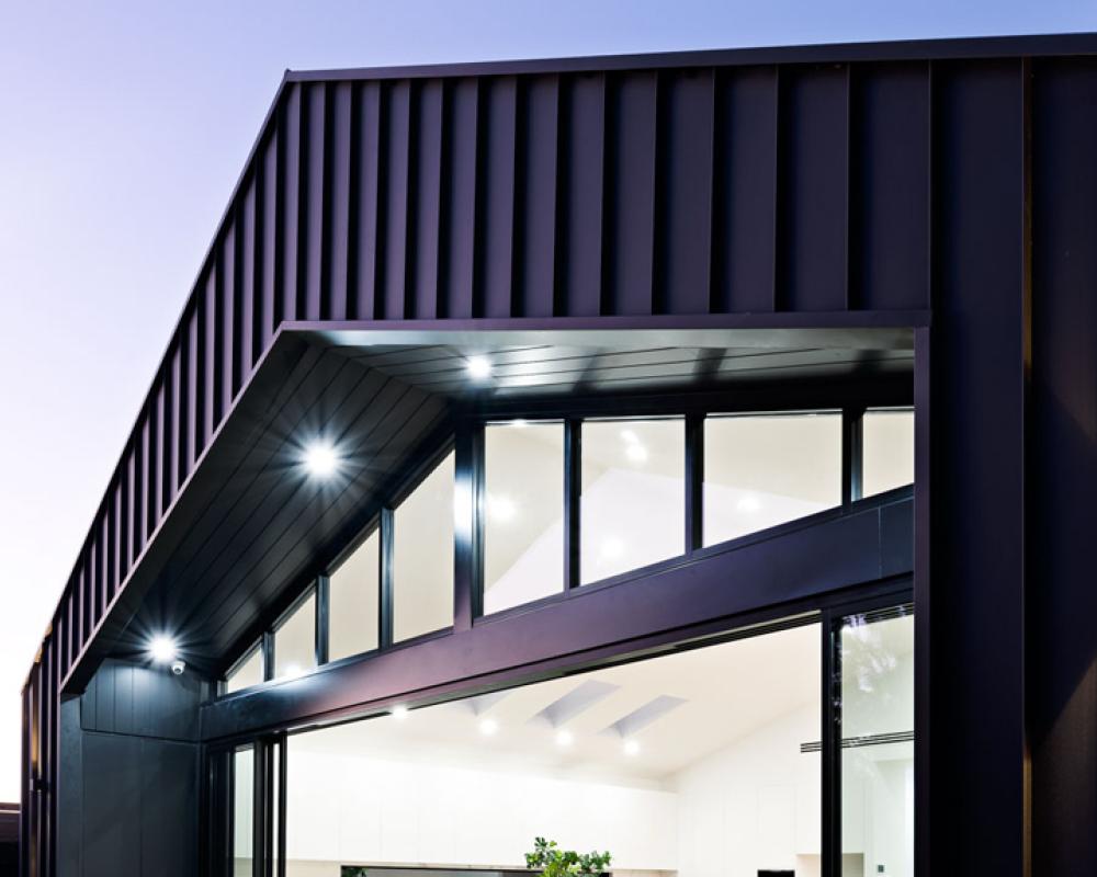
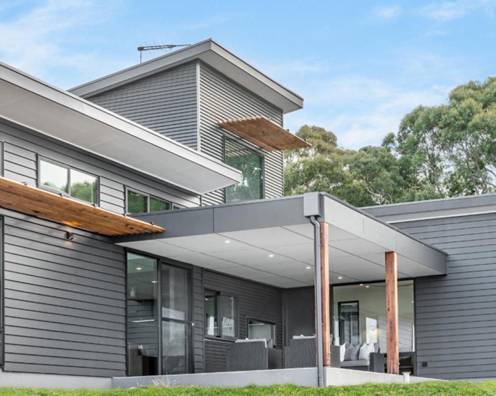
Monument® COLORBOND® steel: a deeper choice
Monument® COLORBOND® steel sits at the opposite end of the chart. It reads almost black in shadow and softens to a warm graphite in full sun.
Monument® tends to suit:
- Modern architectural homes with strong, simple forms
- Cooler climates, where solar absorption is welcome
- Projects that pair steel with dark timber, brick or concrete
In a matt finish, Monument® loses some of the hard edge that very dark colours can carry. The surface becomes more textural and reads more like stone than paint, which is part of why architects often reach for it on contemporary builds.
A note on heat: darker colours absorb more solar energy, so Monument® is best paired with good insulation and ventilation in warmer parts of the country.
Two ends, many options between
Once you understand how Surfmist® and Monument® behave, the colours between them start to make more sense.
If Surfmist® feels too pale, Dover White® or Classic Cream™ shift slightly warmer while staying in the lighter half of the chart. If Monument® feels too dark, Basalt® or Woodland Grey® keep the modern edge with a touch more lift. Earth tones such as Jasper® or Paperbark® bridge the middle for homes that want to settle into a bushland or rural landscape.
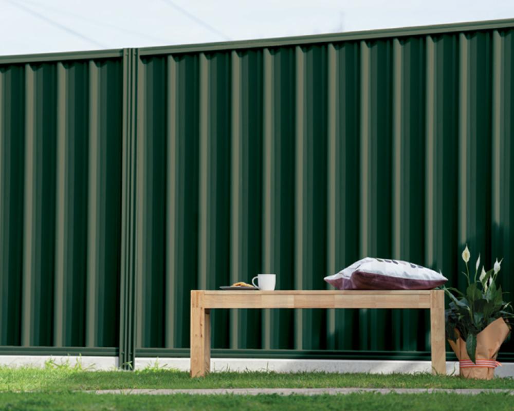
Each colour in the COLORBOND® steel range is available across roofing, gutters and fascia, walling and fencing, which makes it easier to carry a single tone through the whole build. The full COLORBOND® colour chart from BlueScope is the best place to compare options side by side, ideally on full sheets rather than swatches.
Seeing the colour properly
Two final points worth holding onto. First, screens and devices may affect colour tones. A colour viewed on a phone in the kitchen will look different in morning sun on the driveway. Always shortlist using a physical sample.
Second, finish changes everything. The matt finish range gives many COLORBOND® steel colours a softer, more contemporary look that handles light differently to the classic finish.
A starting point for the rest of the range
Surfmist® and Monument® are not your only options, but they are a useful pair to think with. Once you know what each one offers, the rest of the COLORBOND® colours range feels far less daunting.
If you would like help comparing options for your roofing, walling or fencing, the team at Fielders can talk you through what suits your home, your climate and your build. Get in touch to start the conversation.
Lighter colours generally reflect more solar heat, while darker colours generally absorb more. Performance also depends on roof pitch, orientation, insulation and climate zone. For published nominal values, refer to BlueScope Technical Bulletin TB-39.
They sit at opposite ends of the spectrum and are widely used, so they help make the rest of the range easier to compare and shortlist.
Screens can distort tones, and finish changes how colour reads in light. Always shortlist using physical samples.